微信小程序 ui与容器组件总结
1.总结与概述
2.容器组件
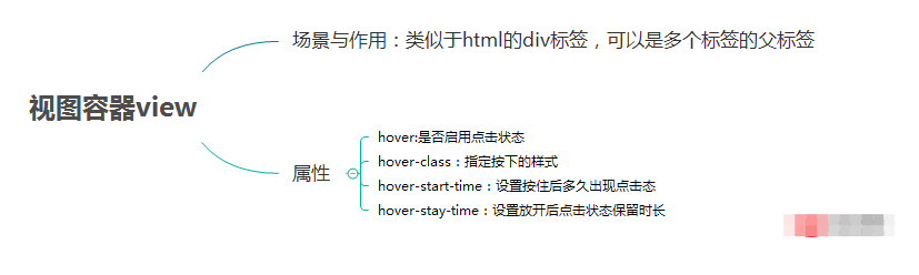
2.1 组件容器(view)
2.2 可滚动视图容器(scroll-view)
2.3 滑块视图容器(swiper)
1.总结与概述
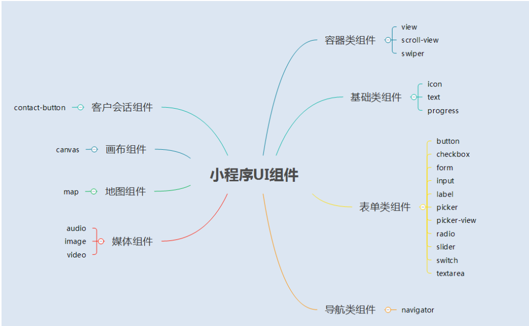
1.1 UI组件总结图
1.2 概述
小程序的UI组件也就是定义用户界面的一系列标签,类似于html标签。一个完整用户响应过程:事件触发——>UI组件接收到事件——>触发js函数响应事件——>更新UI
2.容器组件
2.1 容器组件(view)
(1)总结
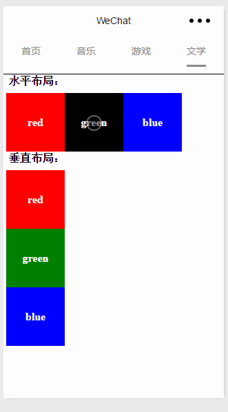
(2)例子
效果图
page.wxml
1 2 3 4 5 6 7 8 9 10 11 12 13 14 15 16 | <view>
<text class="row-view-title">水平布局:</text>
<view class="flex-wrp-row">
<view class="flex-item-red" hover="true" hover-class="hover-style"><text class="color-text">red</text></view>
<view class="flex-item-green" hover="true" hover-class="hover-style"><text class="color-text">green</text></view>
<view class="flex-item-blue" hover="true" hover-class="hover-style"><text class="color-text">blue</text></view>
</view>
</view>
<view>
<text class="column-view-title">垂直布局:</text>
<view class="flex-wrp-column" >
<view class="flex-item-red" hover="true" hover-class="hover-style"><text class="color-text" >red</text></view>
<view class="flex-item-green" hover="true" hover-class="hover-style"><text class="color-text">green</text></view>
<view class="flex-item-blue" hover="true" hover-class="hover-style"><text class="color-text">blue</text></view>
</view>
</view>
|
page.wxss
1 2 3 4 5 6 7 8 9 10 11 12 13 14 15 16 17 18 19 20 21 22 23 24 25 26 27 28 29 30 31 32 33 34 35 36 37 38 39 40 41 42 43 44 45 46 47 48 49 50 51 | .flex-item-red{
background-color: red;
height: 200rpx;
width: 200rpx;
text-align: center;
line-height: 200rpx;
}
.flex-item-green{
background-color: green;
height: 200rpx;
width: 200rpx;
text-align: center;
line-height: 200rpx
}
.flex-item-blue{
background-color: blue;
height: 200rpx;
width: 200rpx;
text-align: center;
line-height: 200rpx
}
.flex-wrp-row{
flex-direction: row;
display: flex;
margin-left: 10rpx;
margin-top: 20rpx;
}
.flex-wrp-column{
flex-direction: column;
display: flex;
margin-left: 10rpx;
margin-top: 20rpx;
}
.color-text{
color: snow;
font-family: 'Times New Roman', Times, serif;
font-weight: bold;
}
.hover-style{
background-color: black;
}
.row-view-title,.column-view-title{
margin-left: 20rpx;
font-family: 'Times New Roman', Times, serif;
font-weight: bold;
}
/*重要属性:
display: flex; //与display:box;是类似,是flexbox的最新语法格式,有更好的适配效果
flex-direction: column; //表示子布局垂直布局
flex-direction: row; //表示子布局为水平布局
*/
|
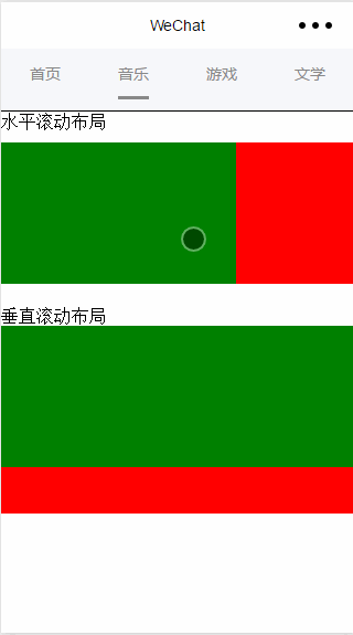
2.2 可滚动视图容器(scroll-view)
(1) 总结
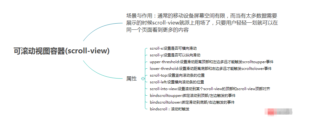
(2) 例子
效果图:
page.wxml
1 2 3 4 5 6 7 8 9 10 11 12 13 14 15 16 17 18 19 20 21 22 | <view>
<text>水平滚动布局</text>
</view>
<view class="x-view">
<scroll-view class="scroll-view-x" scroll-x="true" bindscrolltoupper="scrollXToUpper" bindscrolltolower="scrollXToLower" bindscroll="scroll" scroll-left="0" scroll-into-view="pw_green">
<view id="green" class="x_green"></view>
<view id="red" class="x_red"></view>
<view id="yellow" class="x_yellow"></view>
<view id="blue" class="x_blue"></view>
</scroll-view>
</view>
<view>
<text>垂直滚动布局</text>
</view>
<view class="y-view">
<scroll-view class="scroll-view-y" scroll-y="true" bindscrolltoupper="scrollYToUpper" bindscrolltolower="scrollYToLower" bindscroll="scroll" scroll-top="0" scroll-into-view="pw_green">
<view id="green" class="y_green"></view>
<view id="red" class="y_red"></view>
<view id="yellow" class="y_yellow"></view>
<view id="blue" class="y_blue"></view>
</scroll-view>
</view>
|
page.wxss
1 2 3 4 5 6 7 8 9 10 11 12 13 14 15 16 17 18 19 20 21 22 23 24 25 26 27 28 29 30 31 32 33 34 35 36 37 38 39 40 41 42 43 44 45 46 47 48 49 50 51 52 53 54 55 56 57 58 59 | .x_green{
background-color: green;
width: 500rpx;
height: 300rpx;
display: inline-flex;
}
.x_red{
background-color: red;
width: 500rpx;
height: 300rpx;
display: inline-flex;
}
.x_blue{
background-color: blue;
width: 500rpx;
height: 300rpx;
display: inline-flex;
}
.x_yellow{
background-color: yellow;
width: 500rpx;
height: 300rpx;
display: inline-flex;
}
.y_green{
background-color: green;
width: 100%;
height: 300rpx;
}
.y_red{
background-color: red;
width: 100%;
height: 300rpx;
}
.y_yellow{
background-color: yellow;
width: 100%;
height: 300rpx;
}
.y_blue{
background-color: blue;
width: 100%;
height: 300rpx;
}
.scroll-view-x{
display: flex;
white-space: nowrap;
width: 100%;
margin-bottom: 20px;
margin-top: 10px;
height: 300rpx;
}
.scroll-view-y{
height: 400rpx;
}
|
page.js
1 2 3 4 5 6 7 8 9 10 11 12 13 14 15 16 17 18 19 20 21 22 23 24 25 26 27 28 29 30 31 32 33 | var app = getApp()
Page({
data:{
toview:'red',
},
scrollXToUpper:function(){
console.log('scrollXToUpper')
},
scrollXToLower:function(){
console.log('scrollXToLower')
},
scrollYToUpper:function(){
console.log('scrollYToUpper')
},
scrollYToLower:function(){
console.log('scrollYToLower')
},
scroll:function(){
console.log("scroll")
},
onLoad: function () {
console.log('onLoad')
var that = this
},
})
|
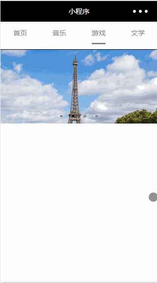
2.3 滑块视图容器(swiper)
(1)总结
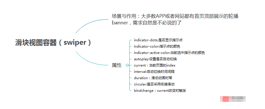
(2)例子
效果图:
page.wxml
1 2 3 4 5 6 7 8 | <swiper data-current="0" current="0" bindchange="itemChangeFunc" circular="true" indicator-dots="pw_indicatorDots"
autoplay="pw_autoplay" interval="pw_interval" duration="pw_duration">
<block wx:for="pw_imgUrls" wx:key="swiperkeys">
<swiper-item>
<image src="pw_item" class="slide-image" width="355" height="150"/>
</swiper-item>
</block>
</swiper>
|
page.js
1 2 3 4 5 6 7 8 9 10 11 12 13 14 15 16 17 18 19 20 21 22 23 24 25 26 27 28 29 30 31 32 | Page({
data: {
imgUrls: [
'/image/wechat.png',
'http://img02.tooopen.com/images/20150928/tooopen_sy_143912755726.jpg',
'http://img06.tooopen.com/images/20160818/tooopen_sy_175866434296.jpg',
'http://img06.tooopen.com/images/20160818/tooopen_sy_175833047715.jpg'
],
indicatorDots: true,
autoplay: true,
interval: 3000,
duration: 1000,
current:1,
},
durationChange: function(e) {
this.setData({
duration: e.detail.value
})
},
durationChange: function(e) {
this.setData({
duration: e.detail.value
})
},
itemChangeFunc:function(e){
console.log(e.detail)
}
})
|
版权声明:本文内容由网络用户投稿,版权归原作者所有,本站不拥有其著作权,亦不承担相应法律责任。如果您发现本站中有涉嫌抄袭或描述失实的内容,请联系我们jiasou666@gmail.com 处理,核实后本网站将在24小时内删除侵权内容。


暂时没有评论,来抢沙发吧~