微信小程序 tab 与 swiper 结合效果实现实例展示

why 70 2024-10-10

本文主要为大家详细介绍了微信小程序实现tab和swiper切换结合效果,具有一定的参考价值,感兴趣的小伙伴们可以参考一下,希望帮助到大家。

本文实例为大家分享了小程序实现tab和swiper切换效果展示的具体代码,供大家参考,具体内容如下
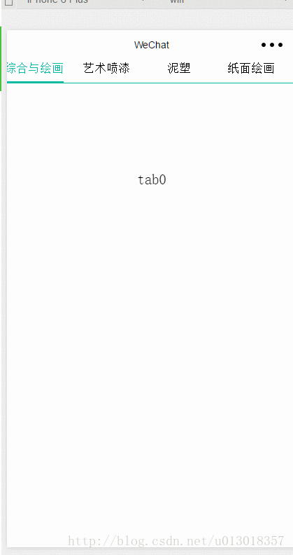
先上效果图:

实现代码如下:

wxml页面


1

2

3

4

5

6

7

8

9

10

11

12

13

14

15

16

17

18

19

20

21

22

23

24

25

26

27

28

29

30

31

32

<scroll-view scroll-x="true" class="weui-navbar">

  <block wx:for-items="{{tabs}}">

  <view id="{{index}}" class="{{activeIndex == index ?&#39;item_on&#39;:&#39;&#39;}} default-item" bindtap="tabClick" style="width:{{tabW}}px">

  {{item}}

  </view>

 </block>

 <view class="weui-navbar-slider" style="transform:translateX({{slideOffset}}px);"></view>

</scroll-view>

<view class="rec" />

<swiper current="{{activeIndex}}" class="swiper-box" duration="100" bindchange="bindChange">

 <swiper-item class="swiper-item">

  <view class="slide-view">tab0</view>

 </swiper-item>

  <swiper-item class="swiper-item">

  <view class="slide-view">tab1</view>

 </swiper-item>

  <swiper-item class="swiper-item">

  <view class="slide-view">tab2</view>

 </swiper-item>

  <swiper-item class="swiper-item">

  <view class="slide-view">tab3</view>

 </swiper-item>

 <swiper-item class="swiper-item">

  <view class="slide-view">tab4</view>

 </swiper-item>

  <swiper-item class="swiper-item">

  <view class="slide-view">tab5</view>

 </swiper-item>

  <swiper-item class="swiper-item">

  <view class="slide-view">tab6</view>

 </swiper-item>

</swiper>

wxss样式:


1

2

3

4

5

6

7

8

9

10

11

12

13

14

15

16

17

18

19

20

21

22

23

24

25

26

27

28

29

30

31

32

33

34

35

36

37

38

39

40

41

42

43

44

45

46

47

48

49

50

51

page {

 height: 100%;

}

view , scroll-view{

 padding: 0px;

 margin: 0px;

}

.weui-navbar{

 width: 100%;

 position: fixed;

 border-bottom: 1px solid #00bba1;

 box-sizing: border-box;

 white-space: nowrap;

 z-index: 100;

 background: white;

}

.rec{

 width: 100%;

 height: 7%;

}

.weui-navbar .default-item{

 /*width:25%;*/

 display: inline-block;

 text-align: center;

 font-size: 32rpx;

 box-sizing: border-box;

 height: 7%;

 padding-bottom: 20rpx;

}

.weui-navbar .item_on{

 color: #00bba1;

}

.weui-navbar-slider{

 position: absolute;

 width: 160rpx;

 height: 2px;

 content:"";

 background: #00bba1;

 bottom: 0px;

 left: 12.5rpx;

 transition: transform .3s;

}

.swiper-box{

 height: 900px;

 border-bottom: 1px solid #d1d1d1;

}

.swiper-box .swiper-item{

 text-align: center;

 padding-top: 200rpx;

 height: 100%;

}

js代码:


1

2

3

4

5

6

7

8

9

10

11

12

13

14

15

16

17

18

19

20

21

22

23

24

25

26

27

28

29

30

31

32

33

34

35

36

37

38

39

40

41

42

43

44

45

46

47

48

49

50

51

52

//index.js

//获取应用实例

var app = getApp();

var mtabW;

Page({

 data: {

 tabs:["综合与绘画","艺术喷漆","泥塑","纸面绘画","布面绘画","中国油画","水墨画"],

 activeIndex:0,

 slideOffset:0,

 tabW:0

 },

 //事件处理函数

 onLoad: function () {

  var that = this;

  wx.getSystemInfo({

   success: function (res) {

    mtabW = res.windowWidth / 4; //设置tab的宽度

    that.setData({

     tabW:mtabW

    })

   }

  });


 },

 bindViewTap: function() {

 wx.navigateTo({

  url: &#39;../logs/logs&#39;

 })

 },

 tabClick:function(e){

  var that = this;

  var idIndex = e.currentTarget.id;

  var offsetW = e.currentTarget.offsetLeft; //2种方法获取距离文档左边有多少距离

  this.setData({

  activeIndex:idIndex,

  slideOffset:offsetW

  });

 },

 bindChange:function(e){

  var current = e.detail.current;

  if((current+1)%4 == 0){


  }

  var offsetW = current * mtabW; //2种方法获取距离文档左边有多少距离

  this.setData({

   activeIndex:current,

   slideOffset:offsetW

  });


 }


})


版权声明:本文内容由网络用户投稿,版权归原作者所有,本站不拥有其著作权,亦不承担相应法律责任。如果您发现本站中有涉嫌抄袭或描述失实的内容,请联系我们jiasou666@gmail.com 处理,核实后本网站将在24小时内删除侵权内容。

上一篇:微信小程序 tab 切换效果实现实例全面分享与解析
下一篇:Vue.js 中 iView UI 框架非工程化实践详细分享
相关文章

 发表评论

暂时没有评论,来抢沙发吧~